How is media
language used to communicate meaning in your given print product?
Print Product: The
Independent Newspaper (Sunday 15 April 2018)

Print products, for example
newspapers, use technical codes to transmit meaning. These products are
constructed by employing a range of techniques designed to appeal to and
attract an audience. Within the set product, the layout and design being a
broadsheet, contributes to the overall style of the publication, as ‘The Independent newspaper’ is considered
to be targeted towards middle aged adults, who are serious minded and highly
literate. The use of colour is evident within the images shown on the front page,
alongside the graphic/ logo positioned just above the nameplate ‘The Independent’. This creates a
consistent style within the newspaper, as the font and text appear to remain in
classic black. The Independent is considered sophisticated due to the fact it
is a broadsheet, along with the fact that there is a coherent style portrayed
throughout. This allows the readers to recognise the type of newspaper it is,
and thus expect it to be consistent. The camera shots used help to communicate
meaning to the audience. This is shown within the main image presented within
the centre of the broadsheet. Theresa May is presented on the front cover,
behind two flags (red and white). She is evidently positioned to be perceived
as stylish with light weight makeup and a black and white polka dot blazer. The
camera shot itself is an eye level shot, engaging the audience/ reader with the
story. May is portrayed to be in a position of authority as she appears to be
looking out; potentially suggesting she is looking at a crowd, whilst
delivering a speech. This positions the audience to be confident within the
leader. The lighting of the image is quite subtle, moving the focus away from
the actual image and more towards the story itself. The graphic/ logo is
presented in red and white, above the nameplate ‘The Independent’ suggesting the logo is a significant part of the
newspapers identity, as it allows the audience to connect and consider such a
logo to the newspaper immediately. The post production techniques evident
within the newspaper are shown in the main image, with the background being
faded out, to bring the immediate focus onto the Prime Minister Theresa May.
This establishes May to be the most important aspect of the image.
One of the means by which
media products convey messages to an audience is through visual codes. Messages
are encoded by the creators of the product and audiences decode these messages.
The main visual codes within the print product include clothing. What is worn
by Theresa May communicates messages about her, to the audience. Theresa May is
wearing a polka dot white and black blazer, alongside light weight makeup,
positioning May to be perceived as a strong, influential leader, who is able to
resonate and relate with the everyday strong career driven woman. The audience
is able to understand the role of Theresa May, and thus have high expectations
of her. The facial expression of May is able to communicate messages to the
reader rapidly. May is shown to be looking within the distant, with a sense of
concentration, suggesting the deterministic nature she holds. Furthermore, the
use of colour in the images, both within the main image and the subfeatures are
of a neutral colour palette, depicting the tone of the newspaper, being a
sophisticated, and highly factual one. The audience are therefore positioned to
view the newspaper as an intellectual broadsheet. The images selected within
the subfeature have been selected to communicate a key message. The subfeatures
consist of four stories; Lords Poised
(Brexit Defeat), Speaking Out (Weinstein Victims), Damned Right ( Punk
Veterans) and Aintree Drama ( Tiger
Roll) which are matched up with images. The images presented reflect the
stories themselves, with an image of parliament reflecting Lords Poised, whilst an image of three women has been selected to
match the speaking out story. An image of a group of five man has been chosen
for the Damned right story, whereas
an image of men on horses has been picked to depict the Aintree drama. The diverse selection of images allows the newspaper
to target different audiences, and tastes, as aspects of politics, music and
sport are covered. In doing so, ‘The
Independent’ is able to appeal to different tastes of readers, extending
their readership. Iconography is evidently depicted in the main image, as the
symbol of the United Kingdom is presented in the form of a symbol. As well as
its literal meaning of the symbol representing Britain, the symbol is able to
be recognised as a sign of unity for the people within Britain. This allows the
reader and audience to engage with the story, and read on to find out what May
has to say about Brexit, and the relations with other countries.
Language and mode of address
is used within the newspaper to ‘speak’ to an audience. The language used also
give clues to who the audience may be and the purpose of the product. The
language and the way it is used are encoded to convey meaning. The lexis (the
actual words) used in the product, are recognisable to the audience, as the
headline reads ‘May hails strike
‘success’ but public denies support’. The referral to ‘strike’ and ‘success’ is
recognisable among the audience, as the headline is referring to the situation
with hundreds of missiles being fired on Syria. The purpose and effect of this
is that the audience who understand the terminology feel part of the members of
‘public’ who ‘denies support’.
Language features are evident within the newspaper as the use of hyperbole; ‘success’ shows how the Prime Minister
perceives the situation as an accomplishment, in comparison to the ‘public’ the readers, who are shown to
have denied the ‘support’. The
language features enable to audience to engage with the news story as a result.
The Independent is shown to
hold a formal mode of address. This is due to the fact that ‘The Independent’ is considered a quality newspaper, and
therefore adopts a more formal tone with more complex vocabulary and writing
styles. An example of complex vocabulary is the use of the phrase ‘impunity’ in the caption; ‘The PM said
the international community would not ‘allow chemical weapons to be used with
impunity’. This suggests that the target audience are more serious and
sophisticated and want more detailed information. The news anchor combined a
formal mode of address with a serious code of expression; this encourages the
audience to trust what they are saying.
The narrative conventions in
print products consists of the structure and the codes and conventions that are
recognisable to audiences. The narrative of a newspaper involves the front
page, which tends to be a conventional structure for the particular newspaper. The
headline; ‘May hails strike ‘success’ but
public denies support’, conveys a detailed and informative narrative in the
quality newspaper, and appears to be a more dramatic and enigmatic, in order to
attract the attention of the reader. The cover lines used in ‘The Independent’ are used to give the
audience clues to what will appear in the newspaper. The cover lines involve; ‘The government faces a Brexit divorce’
, ‘Weinstein victims tell their stories’,
‘The punk veterans on being optimistic’
and ‘Tiger Roll wins a thrilling
national’ in order to engage the reader with the paper, and therefore buy
it, in order to read on. The images and captions used, allow a narrative to be
developed. The caption used alongside the main image; ‘The PM said the international community would not ‘allow chemical
weapons to be used with impunity’ allows different interpretation to be
made by the audience. The image of Theresa May captures moments in time and the
narrative can be deconstructed to establish meaning. The use of language in the
newspaper consisting of ‘justify attack’,
‘consequences’ and ‘threatens more
action’ convey messages of terror for Britain, as well as uncertainty. The
audience are positioned to feel worried, fearful and apprehensive, as countries
such as ‘Russia’ and ‘France’ are also mentioned in the
context of ‘missiles on Syria’ and threatening of ‘more action’. Enigma codes
are a way of holding the interest of the audience. Information is withheld and
teased, from the audience, in order for them to access the whole product in
order to find the narrative in its entirety. This is evident within the lead
stories, as an exclusive from Joe Watts
(political editor) about the topic of Syria and launching air strikes is
presented on the front page of the broadsheet. The enigmas are also created
through headlines ‘May hails strike
‘success’ but public denies support’
alongside the tag lines.
Stuart Hall – Representation
Within ‘The Independent’ Theresa May, the Prime Minister is positioned to
subvert the traditional concept of a female, who possesses inequalities of
power. There is no stereotyping within the broadsheet, as Theresa May is
presented as a strong, influential and determined woman, which allows the
readers/ audience to recognise characteristics as they are able to relate to
her. Representation within the broadsheet, is the way in which meanings are
produced through the signs and codes that are part of media language. Theresa
May is presented as somewhat decisive and untrustworthy as a leader, as the
headline reveals that the ‘public denies
support’ suggesting that the Prime Minister has not been able to
communicate or fully engage with the interests or voices of the people. Therefore,
the representation of Theresa May can be considered a negative one.
David Gauntlett’s – Autonomy of the audience
The audience are provided
with resources to allow them to construct their own identities. Within ‘The Independent’ the audience are able
to construct their own opinion and perception on Theresa May, and the way she
is leading the country. With the use of the headline, the audience is most
likely to perceive Theresa May as a leader who does not listen to the people/
public and is therefore considered a somewhat untrustworthy prime minister. The
audience are therefore able to pick and mix different ideas to construct their
own individual opinion on the leader. Different audiences/ people may intemperate the positive/ negative aspects differently.
Steve Neale
Investigated
genre, specifically in relation to film, but his findings can be applied to
other media forms.
He
states that ‘Genres are instances of
repetition and difference’. This means that familiar elements may be
presented in an unfamiliar way or completely new elements are introduced.
With
the set product, ‘The Independent’ the genre is presented in a familiar way,
with the image matching the caption presented underneath; ‘The PM said the international community would not ‘allow chemical
weapons to be used with impunity’. Theresa May is presented to be
presenting what appears to be a conference, as she stood up in a professional
manner whilst looking out into the crowd.
Difference
is essential to sustain a genre. To simply repeat the codes and conventions of
the form would not appeal to the audience. The difference is evident within the
masthead which reads ‘May hails strike
‘success’ but public denies support’. This is seen as a difference, due to
the fact that on the surface level, May appears in control of the situation, as
she is positioned to be a figure of authority, however, the masthead evidently
shows that the ‘public denies support’ showing
that there is a difference between the image and masthead.
An equilibrium is established in the first bullet point presented in 'The Independent' ; 'Poll on eve of sorties reveals challenge for PM to justify attack' as there is a state in which opposing forces or influences are balanced. In the context of the newspaper, the balance is met between the Prime Minister Theresa May and the public. A disequilibrium is presented in the second bullet point; 'Britain, US and France fire more than 100 missiles on Syria'. The disequilibrium is presented here as there is a lack of stability between the three countries; Britain, US and France. Lastly, as equilibrium is presented in the third bullet point; 'Russia warns of 'consequences' as UK threatens more action' as a sense of opposing forces; Russia and the UK seem to reach a conclusion, whereby they are in a state of balance, as the UK knows there are consequences.
Tzvetan Todorov
An equilibrium is established in the first bullet point presented in 'The Independent' ; 'Poll on eve of sorties reveals challenge for PM to justify attack' as there is a state in which opposing forces or influences are balanced. In the context of the newspaper, the balance is met between the Prime Minister Theresa May and the public. A disequilibrium is presented in the second bullet point; 'Britain, US and France fire more than 100 missiles on Syria'. The disequilibrium is presented here as there is a lack of stability between the three countries; Britain, US and France. Lastly, as equilibrium is presented in the third bullet point; 'Russia warns of 'consequences' as UK threatens more action' as a sense of opposing forces; Russia and the UK seem to reach a conclusion, whereby they are in a state of balance, as the UK knows there are consequences.
How is media language used to communicate meaning in your given print product?
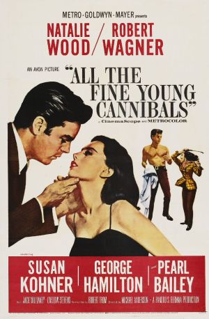
Print Product: 'ALL THE FINE YOUNG CANNIBALS' Movie poster

TECHNICAL CODES IN PRINT PRODUCTS:
Technical Codes have been used in this print product to transmit meaning.
This has been achieved through a range of techniques, which have been designed to appeal to and attract an audience.
These include:
VISUAL CODES:
The way in which the poster conveys messages to an audience.
Ways in which the poster achieves this is through the main visual codes which include:
LANGUAGE AND MODE OF ADRESS:
The ways in which the poster addresses an audience. This is through the language used.
Mode of Address:
THEORISTS: Steve Neale
'Genres are instances of repetition and difference'. Difference is essential to sustain a genre.
From the poster, it can be interpreted that the genre consists of both romance and drama. The images both present a romanticized couple, whilst also showing difference, through the second image, featuring the same couple fighting. The difference engages the interests of the audience and establishes a sense of genres.
Theorist: Tzvetan Todorov
There is disequilibrium presented in the main image. This is because there is no stability or balance between figures. The male appears more dominant in the main image, whilst the female is presented submissive. Thus, there is no equilibrium between the two. Similarly, the second image also shows disequilibrium. The woman is presented to hold dominance over the male. She appears to be yelling at him, whilst holding a cane. The male on the other hand, is defensive, using his left arm to protect his torso. Thus there is no balance of power between the two.
This has been achieved through a range of techniques, which have been designed to appeal to and attract an audience.
These include:
Layout and design: The product is a movie poster, which features a male and female character. The name of the actor and actress is presented at the top of the poster in a red font, in bold letters, to engage the audience with the people featured on the cover themselves. The title of the movie is positioned at the top right hand side of the poster, in a black bold font. The Production Company is shown at the left hand side of the top of the page, just before the title of the film. this helps the audience identify whom the movie has been produced by. The exhibitors/ distributors are presented just below the title, 'CinemaScope' and 'METROCOLOR' to inform the audience on where the screening of the film can take place. Those Co- Starring in the film are presented below the main image; 'SUSAN KOHNER' , 'GEORGE HAMILTON' and PEARL BAILEY' on a red background, to inform the audience who is featuring, being presented in the film.
Camera Shots: The main image presented on the film poster is of a woman and men, embracing in an act of romance. The male appears to be holding her face, while looking at her lips. He is presented as a more dominant and authoritarian figure, as he has control over her. The woman on the other hand appears to be gazing into his eyes whilst moving forward to embrace a kiss. The image is presented to be of a nature of an establishing shot. The main image is juxtaposed against a smaller image, presenting the female holding what appears to be a cane, in her hand. She is shown to be yelling and pointing the cane towards the male figure. The male figure, on the other hand, is standing in a submissive position with his left arm protecting his torso and a shirt being held in his right hand. He is shown to be defenseless, as he has legs wide open, while he is shown to be taking a step back, to avoid the violence. Thus the image are a complete contrast, suggesting the idea that there are two sides of a relationship.
Lighting/ Colour: The main colour of the background is white. This colour has been selected, for the audience to engage in the images themselves, as well as the text. The text at the top of the page is presented in a red font, whilst the title is shown to be in a black font, whilst the text at the bottom is presented in a white font. The variation of colors, allows the poster to be of a more bright colour palate, thus engaging the audience's attention with the product. The female character is shown to be wearing a red lipstick which is portrayed as a seductive colour. She is presented objectively in the main image, as she is wearing a black skimpy dress. The male on the other hand, is wearing a burgundy colour, showing power and authority. At the bottom of the page, there is a red background, highlighting the co - stars who are part of the movie.
VISUAL CODES:
The way in which the poster conveys messages to an audience.
Ways in which the poster achieves this is through the main visual codes which include:
Clothing: The main image features a male and female who are presented as almost a power couple. They appear to be madly in love. The male is wearing a fitted burgundy suit, with a white shirt. This suggests to the audience, that the male is of a high status, and is potentially successful and wealthy. The female on the other hand, is in a black skimpy dress, which bares her shoulders. She is presented quite seductively, as this clothing is paired with a red lip. In contrast to this, there is an image presented to the right of this; the same female is presented in burgundy trousers, and a brown and yellow blazer, alongside a pink scarf. The woman subverts traditional ideals, within this picture, as she is presented to be a dominant figure. The clothing can be interpreted as quite masculine, highlighting the realities of a relationship. The male on the other hand, is bare on his top half, with a blue shirt gripped within his right hand. He is also wearing burgundy trousers and a belt. The two images show a real contrast, in dress code, highlighting the two different aspects of a relationship/ couple.
Expression: The facial expression shown in the main image, is one of awe. Both the male and female appear to be gazing at one another. The woman's lips are parted whilst the male gazes. There is an aspect of intensity and love, as they appear hooked onto one another. The image presented on the right of this, conveys different emotions and facial expressions. The female is frowning, whilst also appearing to be yelling. She is evidently unhappy, angry and frustrated with the male figure. The male figure on the other hand, appears frightened as he has his eyebrows raised and mouth shut. The woman in the second image is shown to be over powering the male, and thus being the authoritarian figure.
Gestures: The main image appears to reveal the male figure holding the female's face. This gesture suggests that the male and female figures are in love. It is a gesture of affection and intense feeling. The woman appears to have her arms by her side, showing that the male is in control of the situation. She is shown to be a submissive figure. In contrast to this, the image on the right hand side, shows the woman holding a cane in her right hand and pointing it to the direction of the male. It suggests that she is going to take action and potentially hit the male figure with this object. The male has his left arm protecting his torso whilst his right hand is holding a blue shirt. He is presented as the submissive figure in this image.
Images: The image on the left presents the ideal representation of a relationship. The male is well groomed, whilst the woman is presented as pretty and well presented. On display, they appear to be a power couple, who are madly in love with one another. However, the reality is presented by the image on the right, where the fighting and arguing are a real representation of the struggles of being a couple. In private, the couple are struggling in disagreement with one another. These images, present a universal idea on perception and reality. In reality, everything is harder than what one may presume.
LANGUAGE AND MODE OF ADRESS:
The ways in which the poster addresses an audience. This is through the language used.
Lexis (Actual words used):
The title 'ALL THE FINE YOUNG CANNIBALS' contains words that are linked to infatuation and awe. The use of 'FINE' in this context refers to attractiveness and beauty. It indicates to the audience that there are aspects of young romance featured in the film. The reference to 'YOUNG' highlights the genre of the film, depicting romance in a period of youth. The use of 'CANNIBALS' can be interpreted as derogatory, as the literal meaning consists of eating the flesh of other human beings. In the context of the poster, it can be interpreted as the couple tearing each other up emotionally and psychologically. There is a sense of destruction and the breaking down of a relationship.
language Features: Certain styles of language are used within this poster, for a specific purpose. The use of puns in the title; 'ALL THE FINE YOUNG CANNIBALS' , engages the audience with the film poster. This allows the film poster, to grab the attention of consumers, and thus create suspension amongst the audience.
Mode of Address:
Informal Mode of Address - The use of informal mode of address is evident within the poster. There is an informal register adopted, for the audience, which is primarily young. The use of colloquial vocabulary in the title 'Fine' and 'Cannibals' is used to engage the target audience, and make them feel a sense of messages being directed, towards them.
THEORISTS: Steve Neale
'Genres are instances of repetition and difference'. Difference is essential to sustain a genre.
From the poster, it can be interpreted that the genre consists of both romance and drama. The images both present a romanticized couple, whilst also showing difference, through the second image, featuring the same couple fighting. The difference engages the interests of the audience and establishes a sense of genres.
Theorist: Tzvetan Todorov
There is disequilibrium presented in the main image. This is because there is no stability or balance between figures. The male appears more dominant in the main image, whilst the female is presented submissive. Thus, there is no equilibrium between the two. Similarly, the second image also shows disequilibrium. The woman is presented to hold dominance over the male. She appears to be yelling at him, whilst holding a cane. The male on the other hand, is defensive, using his left arm to protect his torso. Thus there is no balance of power between the two.
No comments:
Post a Comment